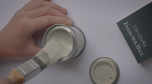
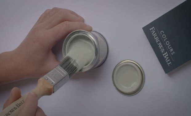
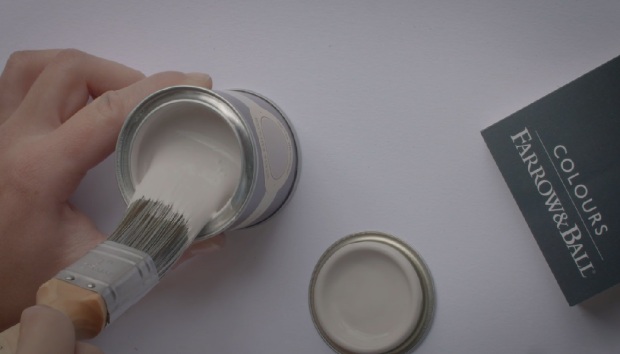
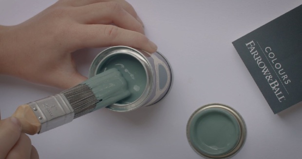
Everybody’s favourite paint brand are really spoiling us as they have launched not one, but nine new colours! I know, exciting isn’t it. I honestly fell in love with all nine of them as soon as I’d seen the collection, they really are exquisite and bang on trend but of course in the classic Farrow & Ball, traditionally British way. I’ve already pretty much worked every single colour into some area of my home in my head, you might be doing the same thing in about 5 seconds. So I won’t keep you waiting any longer, here they are in all their glory. Enjoy X
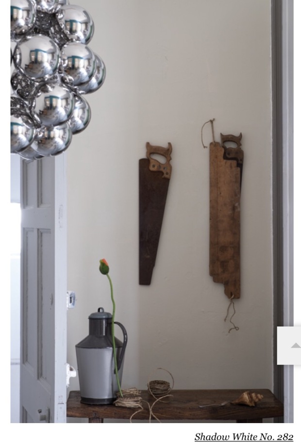
Shadow White no.282
Shadow White is a lighter version of Shaded White, which has long been a Farrow & Ball customer favourite. The names for both these colours are taken from the soft tone they take as they have been covered in a deep shade.
Shadow White is quite a subtle and easy colour to use as it doesn’t have a yellowy base, or even much of a grey one. This colour is really versatile and will work in any home and in most styles.
Pair with Shaded White and Drop Cloth, and experiment on ceilings and woodwork.
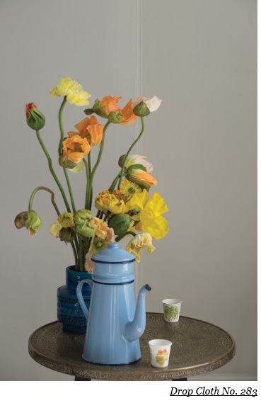
Drop Cloth no.283
Its name is in honour of all those loyal decorators who have used Farrow & Ball over the years, who would of course use dust sheets, traditionally known as drop cloths.
Said to be the strongest hue in the trio made up of itself, and the lighter shades of Shadow White and Shaded White, which together create a classic, versatile and understated colour palette which can be used in any style of home.
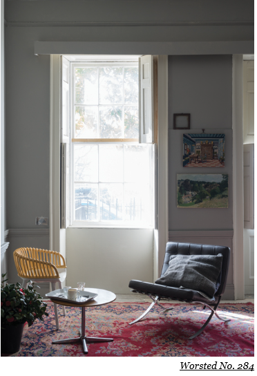
Worsted no.284
This colour takes its name from the Norfolk village of Worsted where the flat woven fabric of the same name, used for city suiting, originates from.
No.284 which is a little darker than Purbeck Stone but not as strong as Mole’s Breath, can be used as an all over colour for a room, or as the background colour in a scheme of clean accents.
Works well with Wevet, Strong White or Cornforth White as the stronger hue in the group.
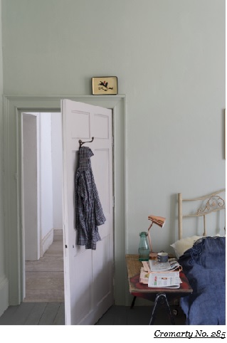
Cromarty no.285
The purpose of the Cromarty Firth estuary is to alert sailors of any impending gales or wind, and so this colour conjures up traditionally British images of Shipping Forecasts and swirling mists.
Cromarty is easy to use as it is neither too blue or too grey, but soft and pretty and lighter than similar colours such as Mizzle, Blue Gray and Pigeon. This colour works perfectly in a more muted palette.
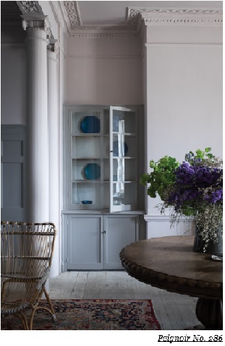
Peignoir no.286
Peignoir is a feminine and sensual colour. Named after the sheer floaty undergarments worn by ladies while brushing their hair in the mid-20th century. This isn’t the first Farrow & Ball colour to be named after an item of clothing, you can learn more about the origins of these fashion -inspired hues – Chemise, Blazer and Babouche, here Farrow & Ball colours.
Peignoir is the softest of pinks with a dose of hazy-grey making it the obvious choice for a bedroom injecting a hint of romance and creating a traditional boudoir feel. This colour sits well in today’s soft, muted pastel trend as well as being perfect for more traditional homes.
Pair with one of the Contemporary Neutrals, and Brassica or Brinjal for a stronger look. All White will give this colour a crisp and modern feel.
This is definitely one of my favourites from the new collection, so much so that I very nearly chose it for my daughter’s new room which I am decorating at the minute. I decided it was a little too feminine and grown up for her, so I might save it for my own bedroom (if I ever get round to it). In stead, I went for Annie Sloan’s Henrietta Chalk Paint which is a lot more girly, and well…very pink! I will post the results as soon as it’s all finished.
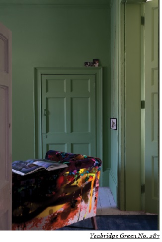
Yeabridge Green no.287
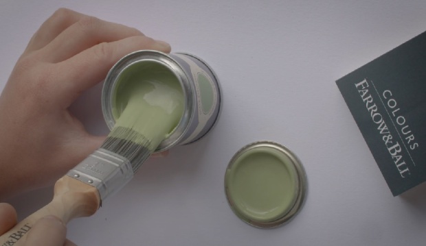
The true ‘avocado green’, Yeabridge Green is fresh and clean an will uplift any colour scheme, and any room for that matter. It has less yellow than Churlish Green but more than Breakfast Room Green, and works really well with Stiffkey Blue.
This is another one of my absolute favs, which makes sense as it originates from my favourite era of all time. Found behind the original gun cupboard in Yeabridge House, an 18th century Georgian Hamstone farmhouse, it had been left untouched for years but somehow was still as vibrant as the lush Somerset grass that surrounded the property.
I’m trying to find some corner of my house to paint this magnificent green as I write this post, it’s just too good to pass up. I’m thinking my stairway might work as it will put a smile on everyone’s face as they walk in. I’m considering Stiffkey Blue for a feature wall in my front room (look out for post on this), so the two colours should work well together (not in the same room though as that would be a bit of an eyesore!).
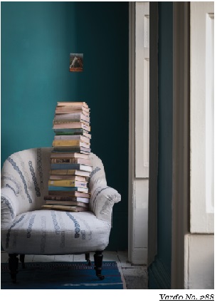
Vardo no.288
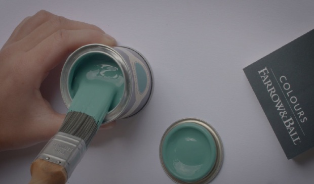
Named after a traditional horse drawn gypsy or Romany wagon which would usually be painted a similar colour over red with intricate detail. This colour is bright, vibrant and full of life. It is a colour that works really well with whites.
Pair with Pavilion Gray for a light and elegant scheme, or with Down Pipe for a darker and more atmospheric look.
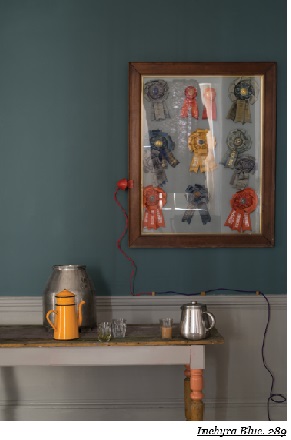
Inchyra Blue no.289
Another one that I love, and surprise surprise, another Georgian-inspired hue. This one hails from Scotland where a bespoke colour was made for Lord and Lady Inchyra at the beautiful classic Georgian Inchyra House. The colour was originally painted on the exterior doors of the property’s exquisite barn, restored in 2013.
Inchyra Blue has depth and it able to stand out against the dramatic and moody Scottish skies. To some this colour reads grey and to others green, either way it is the perfect alternative to charcoal for walls in more contemporary homes. Its other function, for which it is suited very well, is the exterior of older and more traditional properties.
Pair with Black Blue or Vardo for a confident and moody scheme, or with any of the Architectural Whites for a more subtle scheme.
Salon Drab no.290
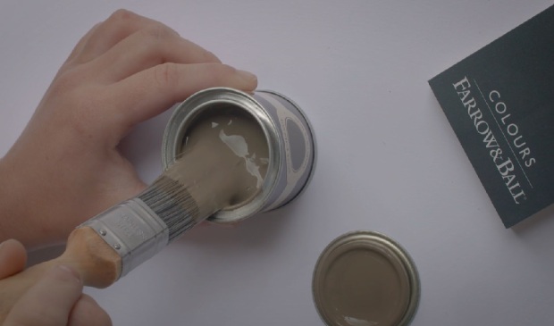
The word Salon refers mainly to the small outer room of a drawing room which is known for being an intellectual conversational hub. Colours named after rooms have always been popular sellers at Farrow & Ball, and ‘drab’ simply describes a colour as lacking in brightness.
Salon Drab is already proving to be a popular colour which works really well with both the yellow and red based neutrals as well as with Skimming Stone. It is stronger and cleaner than Mouse’s Back and far less red than Mahogany.
As a classic 19th century warm and rich drab, its appeal will mostly be for those wanting to recreate the look from this era, although it can also be perceived as being the perfect ‘chocolate’ for the modern home.
So there you have it, nine exquisite new colours to add to Farrow & Ball’s already impressive catalogue of traditionally British hues that will look good in any contemporary home as well. For the full range of colours they have to offer, and more information on their new colours visit their website Farrow & Ball. Also, remember the same colour can often look quite different depending on the light, so it’s always useful to pick up some samples and test them on a room first.