Scallops, Scales, Clamshells and Art Deco

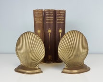
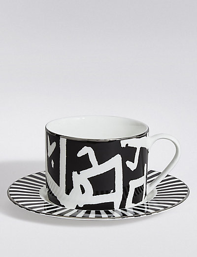
Here at Lois Interiors we were absolutely thrilled when the ‘scallop shell’ trend of 2019 hit the blogs and magazines at the end of last year. We’ve always had a big thing for scallop and clam shell patterns and curved furniture, and just couldn’t hide our excitement when both trends pushed their way back to the forefront of this years interiors.
We hoped all these shells and curves would lead us into the next big trend…the revival of Art Deco, and were so pleased when our interior prayers were answered.

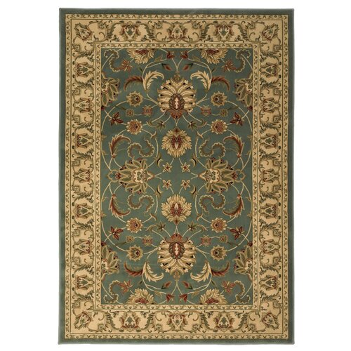
Its back! Art Deco will be a key trend in 2019 but has been re-imagined into a more feminine look with softer colours and curved edges, but still with all the glamour and grandeur of this classic era. We’ve been waiting a while for the distinctive style of this trend to make a come back, and now that it has, we’re all over it!

With this trend you can expect to see bold colours, statement patterns and a whole lot of opulence!
Not quite the Art Deco of the 20s and 30s though; the trend has caught up to speed and has decided that rigid patterns and straight lines are too predictable, and has in stead embraced the curves. Scallop shells have always played a part in Art Deco interiors, but originally would have appeared in the form of a statement piece surrounded by geometric shapes and straight lines. Fast forward 90 odd years and the shells are back with a vengeance, and we can’t get enough.

As well as lots of shells and curves, the Art Deco trend of 2019 will feature softer colours such as pink and gold, which have always played a role in Art Deco, but were often over shadowed by the more masculine colours which were typical of the Art Deco era such as black, chrome and the dark blues and greens, which will all take a back seat in 2019.
This will transform the Art Deco of today into a slightly more liveable, less formal and less contrived style. As much as we love the Art Deco era, its designs were a little garish, but now you can enjoy all the luxury and glamour, just in a slightly more subtle and practical way.

This trend is all about laid back glamour, softer edges and more feminine colours to bring the Art Deco era into the modern day home where practicality, sophistication, and a bit of fun is exactly what we want!

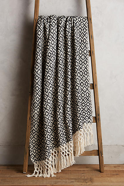
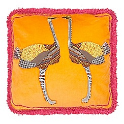
Here are some of our favourite looks from this trend…

A beautiful luxe, Art Deco scheme designed by the brother-sister duo of Maison 24. This original New York townhouse has been given a modern take on an Art Deco makeover. The soft, yet striking pink in the dining room is not just luxurious and eye-catching, but also helps to soften up the room by adding a feminine contrast in the colour, and curved furniture, to the typical black Art Deco flooring.

Everyone’s favourite pink, scallop shell London restaurant…Sketch. You can see why this is one of the most Instagram-able spots in town, and we can’t get enough of this beautiful Art Deco scheme.
This lovely bedroom designed by Maria aka The Interior Editor, is filled with some of Art Deco’s most loved colours – pink, green, blue and yellow, but all in much softer tones. The result is a much more feminine and cosier scheme.

Also, check out this collection from one of our fav furniture and homeware designer’s…Bethan Gray for Anthropologie
Here are some of our favourite pieces from the amazing collection:

Bethan Gray Feather Collection Dining Chair
Available in 3 different colours
£598
Bethan Gray Feather Collection Bed
£2,098
Bethan Gray Feather Collection Bar Cabinet
£2,098

Pretty in…Rose Gold

One of my favourite colour trends that never go out of style; timeless, luxurious, feminine, sparkly and fun…rose gold!

The wonderful Graham and Brown which is one of my favourite go-to’s for wallpaper inspiration, has a brand new colour ‘Trinity Soft Rose Gold Wallpaper’, and I love it.
It’s quite a statement print with triangular geometrics, they are hand drawn though which helps to soften the look.
I think this would be the perfect bedroom wallpaper, perhaps just on a feature wall as a soft, flirty backdrop for a bed.

Men…don’t be put off by the words ‘feminine, fun and flirty’, rose gold has a place in any space as I think it can also be considered a bold and powerful colour. I particularly like rose gold as an accent colour in an office, paired with brown leather and truffle coloured walls…now that’s a dream combination!

Trinity Soft Rose Gold Wallpaper, , large

Trinity Soft Rose Gold Wallpaper, , large

Graham & Brown’s new ‘Trinity Soft Rose Gold Wallpaper’ can be purchased here.


Also…how amazing is this ‘Fan Rose Gold Wallpaper’? Totally reminds me of clam shells (my favourite) just pink sparkly ones.

Fan Rose Gold Wallpaper, , large

Fan Rose Gold Wallpaper, , large

One man’s trash…

Out on my usual early morning dog-toilet-run today, I had a very welcome surprise. This lovely set of nest side tables sat outside a neighbours house seeking a new home:

image

Ok, there are only 2 so 1 is probably missing and they’re a little scratched up, but come on guys, they were free…and I only had to carry them 4 doors down!

If you know me you know these are right up my street; antique, elegant and unique which is certainly helped by the ‘shabby chic’ look (or sat out in the rain, now smell like wet old wood look). The best thing about my new find is that I actually needed a side table to sit next to my armchair so I can cross this job off my very long ‘house needs’ list…cheers no. 34 Sunderland Road!

The only slightly annoying thing about street finds is that the origin of the piece is a complete mystery. One of my favourite things about antiques is the history and story behind everything I buy and being able to tell people what era it came from and what style or trend it belonged to.

But, perhaps trying to figure that out on your own is part of the fun?
Ok…so…there is definitely a Victorian look here with the dark walnut looking wood and intricate carvings on the legs, or carved knee detailing to be specific. The pad feet and slight cabriole legs suggest this piece could even date as far back as the 18th century. The cabriole legs aren’t concave at the bottom though as they traditionally tend to be, I’m not sure if this means anything but I will continue my research on that.
The table tops are serpentine shaped with decorative carved corners, again suggesting 18th/19th century.

Of course this could be a replica as a lot of antiques these days tend to be, but I’m quite convinced it’s an authentically old piece, mainly based on the condition of them and how old the wood looks. I guess I’ll never know for sure, unless I head down o Antiques Roadshow. Maybe I should apply for a job while I’m there…hmmm!

image.jpeg

She sells CLAMSHELLS by the seashore

My crazy new obsession – clamshells! Bit of an odd one I know, but stick with me for a few minutes.
It all started with this beautifully classic Graham and Green chair:


Ariel Shell Chair £695

You starting to see it, make sense? Ahh yes I told you didn’t I. For me, clamshell interiors are about as elegant and exquisite as pearl jewellery – pure class. The stunning shape and natural muted tones that usually come along with clamshells means they can sit perfectly in any home and any scheme, adding a touch of sophistication wherever they go.

Once this chair had caught my eye I did a quick Google search and discovered that clamshells for the home can come in many different shapes and sizes, and to my delight, the possibilities are endless. You can keep it simple with a subtle piece here and there:

Or, go clamshell mad with a massive statement piece:

Either way, there are so many options to choose from, though I would probably stick to one statement piece, or one or two smaller shells around the house as this is a style you really don’t want to overdo.

Probably my favourite type of clamshell is the gold or brass decorative kind you might spot in your own home if you look closely enough. Just enough to add a touch of glamour without going overboard, is the perfect balance. Like the feet on this bath:

Or the detail on my bed which I hadn’t really thought about too much before:

my bed.jpg

My antique paper weight is a fine example of that old classic clamshell look that I love:

image

For me, iconic images of clamshells conjures up thoughts of two of my favourite eras – art deco, with its clamshell wall sconces, and the 50’s with its clamshell chairs. A match made in heaven. Here are some of the best clamshell inspired interiors and pieces I’ve seen around, including some antique beauties which I adore the most and will certainly be on the lookout for when I start a clamshell collection of my own. Enjoy.

Mid Century Outdoor Furniture 1950's Metal Clam by TaileesDesigns:

Jeudi J'aime: 10 inspirations estivales | NIGHTLIFE.CA:


Bit too far? Yeah I think so!


Shhh…no talking in the library!

So my house is in that kind of in between – decorating/organising/moving all the rubbish from one room to the next phase. I literally bag all the stuff up that I don’t want any more and move it into another room. It’s driving me mad.
One positive thing that is happening though, is my daughter’s new bedroom is being decorated. It’s painted, the toys are in, and her bed is stuck halfway through the doorway of her old bedroom (I’m waiting for someone to come over and help me carry it. Like with everything else, I thought I could do it on my own, but failed. Must remember, I am not Superwoman!). Anyway, I’ve come to realise somewhere along this ‘sorting my house out’ journey that whilst I have a big flat with lots of space, I hardly have any storage. I am in desperate need of places to put things so that, again, I can move all the things that I don’t know what to do with, somewhere else.

On that note, one of my recent purchases, well actually my mum bought it *thanks mum*, is this classic library style bookcase for my daughter’s new room.

bookcase

Also known as the Potter Library Table from Great Little Trading Company this bookcase conjures up memories of sitting on the library floor as a child, when public libraries were at the centre of our childhood and we could spend hours around one of these little tables quietly scattering books all over the place and entertaining ourselves undisturbed.
Thankfully we have a wonderful little library near us so my daughter has been able to enjoy the peaceful memories I have of visits to the library, and now she can play library everyday in her own room.
It’s the perfect size and height; we managed to fit the majority of her fairly large book collection into the table, and she can access all the books without any help which means she loves having a good rummage through before bed to choose her bedtime stories.

The bookcase is £95 *again, thanks mum*, but keep your eye out for their sales which do happen quite often. I will have more bedroom decorating news soon, I hope, so look out for that.

XO


Graham & Green

Anyone who knows me will already know how much I love Graham & Green. I don’t know what it is, they just do it for me, every time. They are the perfect blend of contemporary and classic design, bringing old together with new, whilst combining their love of travel and the Far East with their quintessentially British style. For me, they’ve got the balance just right and the result is an elegant, classic brand with a modern twist. Just perfect.

It all started with their shop in Greenwich which I used to visit often with my mum, such a shame it’s no longer there! I still remember a beautiful big faux fur throw I fell in love with and tried to persuade my mum into buying. It was dark brown, super soft and luxurious, just like everything else in that shop. I was too young to understand that the price tags attached were often fairly luxurious too.
It has since been my go-to website for inspiration, a little mosey here and there and an occasional buy when I’m looking for something beautiful and elegant for my home. Unfortunately I have to stick to their accessories and decor bits as most of their furniture is a little over my budget, thankfully their sales are pretty good so I keep an eye out for them.

Anyway, this post wasn’t supposed to be all about my obsession with Graham & Green so I shall stop gushing. Following on from a previous post of mine on this year’s biggest Spring trends, one of my favourites in particular – marble, I absolutely had to write about G&G’s Spring collection. They have designed some of the most elegant and beautiful marble pieces, often paired with brass and gold finishes for the perfect touch of luxury. Of course I’m absolutely obsessed with everything and could quite happily fill my house with marble tables and lamps at the minute as it’s definitely my top trend so far this year. Let’s see if you’re as enthralled as I am, here are my top picks from this collection…

image

White Marble Shimmering Lamp £110

image

Linear Side Table Green Marble Top £295

image.jpeg

Hex Side Table With Marble Top £250

image

Andre Half Moon Console £475

image

Agate Side Table £125

image

Natural Agate Coffee Table £275

Linear Table Light Green Marble Base £135

Cactus Lamp £95

White Marble and Brass Ceiling Pendant £85

Marble Heptagon Clock £35

Marble Cheese Board £30

Detroit Oval Coffee Table £195

Detroit Console Table £250

To view the entire marble range, or if you’d like to buy me an early Christmas present (I’ll have the Cactus Lamp please) then visit my favourite website Graham & Green.

South London Vintage Furniture Flea

Well my weekend wasn’t too shabby, went to this wonderful little flea market for the first time and walked out with a brand new dining table and chairs, well I didn’t actually walk out with it obviously but I bought it and had it delivered later on that day.

Judy Berger set up these markets in 2005 with the hope of creating an affordable way to shop all things vintage in London which, let’s admit, isn’t an easy task these days as prices have absolutely soared in the last few years.
The idea is to get together a bunch of awesome traders from all over the UK who sell affordable, original and beautiful vintage pieces, throw them all together in different locations across the city for a day or a weekend. This weekend the fair was in Clapham and as a first timer I conclude that Judy’s recipe for amazing, affordable and one-off vintage finds works. It really does!

I made the mistake of taking my 3 year old and 5 month old puppy along with me which meant that my idea of ‘a casual browse and a couple of laps around’ didn’t quite happen. I ended up carrying the dog who was too hyper to walk around, so out of fear of him jumping up and scratching some beautiful vintage chair, I cradled him like a baby while he licked my ear and got so much attention from everyone that he nearly burst from excitement. I think my daughter was a little disappointed when we got there as it wasn’t quite what she was expecting, I suppose the sentence “we’re going to the fair today” would confuse any toddler. I wondered why she was so up for going earlier that day, then when I saw her face drop when we arrived I suddenly realised. Oops!
All was not lost though, about 30 seconds in I spotted the most wonderful dining table and chairs, exactly the style I was looking for! A retro set made in the 50’s as a 18th century replica. The perfectly round mahogany style table isn’t a drop leaf like I’m used to, but tips with the flick of a handy little catch underneath the table top allowing it to fold into a streamlined piece of furniture so that it can be pushed against the wall completely out of the way. How amazing? The four beautiful chairs are complete with gold and green patterned seatpads, which works well with the light blue accents in my kitchen.

As you can probably tell, I’m really pleased with it (although it was tough getting rid of my Ercol table to make room), and I can’t wait to get the rest of my kitchen up to retro-scratch, which is the look I already had in mind before I even found the table. I will keep you posted!

image

And here I am blogging at my new table with my new mugs from  Hema. They were £4 for 2 so I got some navy blue ones as well to add to my green/blue accents.

image

Keep an eye on Judy’s Vintage Fair to find out when they’ll be coming to a town near you!


Farrow & Ball – new colour alert!

Everybody’s favourite paint brand are really spoiling us as they have launched not one, but nine new colours! I know, exciting isn’t it. I honestly fell in love with all nine of them as soon as I’d seen the collection, they really are exquisite and bang on trend but of course in the classic Farrow & Ball, traditionally British way. I’ve already pretty much worked every single colour into some area of my home in my head, you might be doing the same thing in about 5 seconds. So I won’t keep you waiting any longer, here they are in all their glory. Enjoy X


Shadow White no.282

image

Shadow White is a lighter version of Shaded White, which has long been a Farrow & Ball customer favourite. The names for both these colours are taken from the soft tone they take as they have been covered in a deep shade.
Shadow White is quite a subtle and easy colour to use as it doesn’t have a yellowy base, or even much of a grey one. This colour is really versatile and will work in any home and in most styles.
Pair with Shaded White and Drop Cloth, and experiment on ceilings and woodwork.

image


Drop Cloth no.283

drop cloth 2.jpg

Its name is in honour of all those loyal decorators who have used Farrow & Ball over the years, who would of course use dust sheets, traditionally known as drop cloths.
Said to be the strongest hue in the trio made up of itself, and the lighter shades of Shadow White and Shaded White, which together create a classic, versatile and understated colour palette which can be used in any style of home.

droop cloth 3


Worsted no.284

worsted.png

This colour takes its name from the Norfolk village of Worsted where the flat woven fabric of the same name, used for city suiting, originates from.
No.284 which is a little darker than Purbeck Stone but not as strong as Mole’s Breath, can be used as an all over colour for a room, or as the background colour in a scheme of clean accents.
Works well with Wevet, Strong White or Cornforth White as the stronger hue in the group.

worsted 2.png


Cromarty no.285

cromarty 2.png

The purpose of the Cromarty Firth estuary is to alert sailors of any impending gales or wind, and so this colour conjures up traditionally British images of Shipping Forecasts and swirling mists.
Cromarty is easy to use as it is neither too blue or too grey, but soft and pretty and lighter than similar colours such as Mizzle, Blue Gray and Pigeon. This colour works perfectly in a more muted palette.

cromarty 3


Peignoir no.286

Peignoir.jpg

Peignoir is a feminine and sensual colour. Named after the sheer floaty undergarments worn by ladies while brushing their hair in the mid-20th century. This isn’t the first Farrow & Ball colour to be named after an item of clothing, you can learn more about the origins of these fashion -inspired hues – Chemise, Blazer and Babouche, here Farrow & Ball colours.
Peignoir is the softest of pinks with a dose of hazy-grey making it the obvious choice for a bedroom injecting a hint of romance and creating a traditional boudoir feel. This colour sits well in today’s soft, muted pastel trend as well as being perfect for more traditional homes.
Pair with one of the Contemporary Neutrals, and Brassica or Brinjal for a stronger look. All White will give this colour a crisp and modern feel.
This is definitely one of my favourites from the new collection, so much so that I very nearly chose it for my daughter’s new room which I am decorating at the minute. I decided it was a little too feminine and grown up for her, so I might save it for my own bedroom (if I ever get round to it). In stead, I went for Annie Sloan’s Henrietta Chalk Paint which is a lot more girly, and well…very pink! I will post the results as soon as it’s all finished.

peignoir 2


Yeabridge Green no.287

yearbridge green.jpg

The true ‘avocado green’, Yeabridge Green is fresh and clean an will uplift any colour scheme, and any room for that matter. It has less yellow than Churlish Green but more than Breakfast Room Green, and works really well with Stiffkey Blue.
This is another one of my absolute favs, which makes sense as it originates from my  favourite era of all time. Found behind the original gun cupboard in Yeabridge House, an 18th century Georgian Hamstone farmhouse, it had been left untouched for years but somehow was still as vibrant as the lush Somerset grass that surrounded the property.
I’m trying to find some corner of my house to paint this magnificent green as I write this post, it’s just too good to pass up. I’m thinking my stairway might work as it will put a smile on everyone’s face as they walk in. I’m considering Stiffkey Blue for a feature wall in my front room (look out for post on this), so the two colours should work well together (not in the same room though as that would be a bit of an eyesore!).

yearbridge green 2.jpg


Vardo no.288

vardo

Named after a traditional horse drawn gypsy or Romany wagon which would usually be painted a similar colour over red with intricate detail. This colour is bright, vibrant and full of life. It is a colour that works really well with whites.
Pair with Pavilion Gray for a light and elegant scheme, or with Down Pipe for a darker and more atmospheric look.

vardo 2.jpg


Inchyra Blue no.289

inchyra blue.jpg

Another one that I love, and surprise surprise, another Georgian-inspired hue. This one hails from Scotland where a bespoke colour was made for Lord and Lady Inchyra at the beautiful classic Georgian Inchyra House. The colour was originally painted on the exterior doors of the property’s exquisite barn, restored in 2013.
Inchyra Blue has depth and it able to stand out against the dramatic and moody Scottish skies. To some this colour reads grey and to others green, either way it is the perfect alternative to charcoal for walls in more contemporary homes. Its other function, for which it is suited very well, is the exterior of older and more traditional properties.
Pair with Black Blue or Vardo for a confident and moody scheme, or with any of the Architectural Whites for a more subtle scheme.

inchyra blue 2


Salon Drab no.290

salon drab

The word Salon refers mainly to the small outer room of a drawing room which is known for being an intellectual conversational hub. Colours named after rooms have always been popular sellers at Farrow & Ball, and ‘drab’ simply describes a colour as lacking in brightness.
Salon Drab is already proving to be a popular colour which works really well with both the yellow and red based neutrals as well as with Skimming Stone. It is stronger and cleaner than Mouse’s Back and far less red than Mahogany.
As a classic 19th century warm and rich drab, its appeal will mostly be for those wanting to recreate the look from this era, although it can also be perceived as being the perfect ‘chocolate’ for the modern home.


So there you have it, nine exquisite new colours to add to Farrow & Ball’s already impressive catalogue of traditionally British hues that will look good in any contemporary home as well. For the full range of colours they have to offer, and more information on their new colours visit their website Farrow & Ball. Also, remember the same colour can often look quite different depending on the light, so it’s always useful to pick up some samples and test them on a room first.


April – to spring or not to spring?

Gone are the days when Spring trends were all about bright yellows, fuchsia pinks and flowers and birds. We’ve turned a corner, and learnt that everybody’s favourite season is as much about nature and brining the great outdoors into our homes in a slightly more subtle way, as it is about being bright and floral, unless that’s what you like, in which case, feel free of course.

If, like me, you are looking for some fresh ideas for your home now that Spring is upon us; then read on. This year’s spring trends are all about simplicity and elegance, neutral and muted colour palettes and accents of luxurious textures. Here are some of 2016’s top Spring trends, and where to find them.


Monochrome

A trend that pops up often, or never really goes away. You can’t go wrong with this one, but you can update it this Spring in one of two ways. Some sources are telling us to throw the chevron prints out as it’s all about muted colour palettes and simple monochrome patterns this season, whilst others are telling us to opt for graphic monochrome: sharp masculine lines and graphic prints. Here are some of my favourite pieces from this trend so have a look and decide which monochrome style you prefer, for me, the simpler look wins.

Top buys for this trend…


Diamond Weave Throw
Anthropologie
£88

diamond_cut_matte_vase_cp
Diamond cut matte black vase
Kelly Hoppen
£99

Classic black and white mason jar bathroom set , bronze pump, rustic, distressed, shabby chic, cottage, country, home decor, soap dispenser
Classic black and white mason jar bathroom set
Etsy
$45

An array of textures can help to add interest to a more simple monochrome scheme.


Daborn armchair
Habitat
£650

Stripe Blanket With Blue Pom
Stripe blanket with blue pom
Graham and Green
£149


Sue Timney cup and saucer
Marks & Spencer
£9.50

If you’re into the ‘go big or go home’ way of thinking, then this kind of scheme might be for you.


Matte

This trend ties in quite nicely with monochrome, as matte finishes work really well with black. It makes sense; matte finishes offer an interesting textural element to more neutral and simple schemes which might be lacking the ‘wow factor’ in comparison to brighter Spring trends of yesteryear (cheers for that one Rachel Green). The wonderful thing about matte is it works well alongside other textures and an array of colours, particularly metallic so if you’ve got any still laying around from last year’s trend, don’t get rid just yet!

Top buys for this trend…

Damon Arm Chair
Damon Arm Chair
Wayfair
£118

Buy Tom Dixon Beat Wide Ceiling Pendant Light Online at johnlewis.com
Tom Dixon Beat Wide ceiling pendant light, grey
John Lewis
£285

Pineapple matte black
Pols Potten
£48


Marble

Probably one of my favourite trends this Spring is marble. It oozes luxury but still manages to reamain elegant and classic. The price tags that come along with this look are usually quite ‘luxurious’ too, so for that reason it is wise to stick to marble accents and accessories. Please please pair marble with brass, copper, or anything gold to create a contrast between the cool stone and the warmer gold colours – the results are phenomenal! Here are a few things I’ve got my eye on…

Top buys for this trend…


Regione marble cheese board
Anthropologie
£88

Marble Heptagon Clock
Marble heptagon clock
Graham and green
£35

Double tiered marble cake stand
Oliver Bonas
£78

Crochet and macramé

Last, and for me, least. I have to admit, this is not my favourite trend. I’ve never really been a boho-chic kind of girl so I won’t be inviting this style into my home any time soon, although I do see the appeal. It’s laid back, it’s versatile and I suppose a splash here and there might add a touch of Spring into the home. If you’re into it, here are my picks…

Top buys for this trend…


Festivities basket
Anthropologie
£42


James’ giant apple pouffe
Rowen and Wren
£244


Palacio hammock in jacquard
The Range
£141.99


If, you’ve spent the entire time skimming through this blog trying to get to the bit with all the bright colours and bold patterns, well here it is. For those of you who have no interest in being simple and neutral this Spring, then here’s a collection of some of my favourite ‘jungle looks’ that seem to be cropping up everywhere at the moment. Enjoy X
Abigail Ahern/EDITION - Ostrich applique cushion
Abigail Ahern for Debenhams
Ostrich applique cushion
£40
Abigail Ahern/EDITION - Elephant applique cushion
Abigail Ahern for Debenhams
Elephant applique cushion
£35

Africa chair
Habitat
£45

Coral Cactus Round Metal Table
Pink coral cactus round metal table
Oliver Bonas
£65

Blue Ikat Pouffe
Blue ikat pouffe
Graham and Green
£150


Patterned cotton tablecloth
H&M
£14.99


Leafy jungle cushion
Rose & Grey
£49.50

Tropical beach interior with cane chair palm print wallpaper & cushions & cane pendant light:


First post-me and my granny rugs

Well, here it is, my very first post (eeek!). I thought I’d start off by sharing with you my latest purchase and recent obsession. My new granny rug. I have a bit of a thing for them and I have a feeling that I’m not going to be able to stop at just the two.

The pink rug in my bedroom was the first in the collection and I think I was drawn to it because it reminded me of a very similar pink, round rug that my grandma used to have. Anyone else remember those? Yep, I love them!

If you like my old lady style and want to granny up one of your rooms, both rugs are from Wayfair which used to be known as Joss and Main. Look out for their sales, and my next granny rug purchase of course!

Brook Lane Rugs Kendra Blue Area Rugimage1.jpeg